
Chapter 3
Creative Problem-Solving
Beyond Functional Interface:
Bring Fun and Immersion to Our Gaming Platform
Challenge
“Make it more fun and immersive than anything out there.”
When our CEO first outlined his vision for our Web3 gaming platform, he emphasized one key directive: "Make it more fun and immersive than anything out there." This wasn't just about creating a functional interface—it was about extending the game experience into every aspect of the platform.
The challenge was clear: how could we transform standard web elements into playful, engaging experiences that kept users immersed in our game world?
Reimagining User Profile
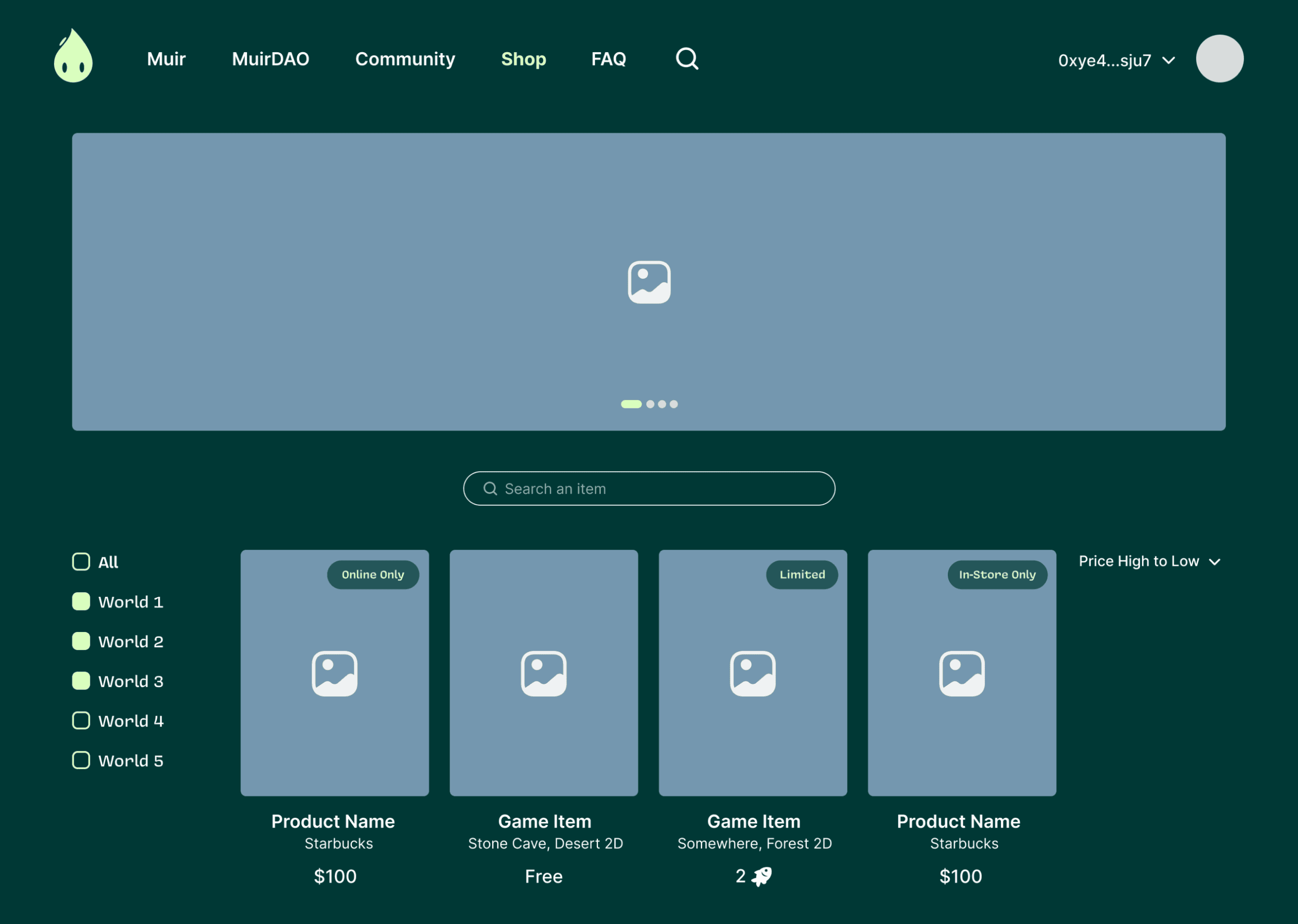
NFT Reward Triangle Tiers
The Profile Challenge
Our reward system had a fundamental constraint—limited NFTs in each tier—and we needed a visual representation that clearly communicated a user's status and progression path. Standard profiles with simple progress bars wouldn't deliver the immersive experience our CEO demanded.
Breaking Convention
I spent several late nights exploring unconventional approaches, sketching dozens of patterns and visualizations. Something about traditional tier indicators felt too corporate, too mundane for our gaming platform.
During one brainstorming session, I found myself drawing geometric shapes—circles, hexagons, and triangles. The triangles caught my eye—they naturally created a hierarchical visual structure while offering creative flexibility.

The Triangular Solution
I developed a system where each tier appeared as a triangular formation with distinctive color schemes—solid color for the lowest tier gradually transitioning to vibrant color combinations for higher ones. The number of NFTs decreased as users moved up, which I visualized by reducing the triangle count while making each one more visually striking.

From Status Symbol to Game Element
When I presented this concept, our CEO's reaction was immediate: "This doesn't just show status—it makes status exciting!" The triangle system transformed profile pages from simple information displays into visual achievements that users proudly shared on social media.
What began as a functional requirement evolved into a signature element of our platform, with our triangular tiers becoming instantly recognizable in the Web3 gaming community. Users began referring to their progress not by level numbers but by their triangle configurations.
Reimagining our Universe Navigation
From Convention to Cosmic
A Disappointing Start
After completing the home page, I created what I thought was a clean, efficient navigation system for our internal pages. The design was functional and followed best practices, but when I presented it, the room fell silent. Our CEO finally spoke: "It looks just like every other website. Where's the immersion we talked about?"
The Midnight Realization
That night, I couldn't sleep. Our game universe consisted of multiple dimensions with different frequencies—rich with creative potential—yet I had reduced it to standard dropdown menus. I opened my laptop at 2 AM and asked myself a simple question: "What if navigation wasn't just a tool but part of the game experience?"
Cosmic Navigation Takes Shape
I completely reimagined our approach, designing a cosmic navigation system where dimensions appeared as planets in space, each displaying its frequency range. Rather than clicking through menus, users would navigate through a miniature universe, making menu exploration feel like gameplay.

A Universe in a Menu
When I nervously presented this radically different concept the next day, the conference room erupted in excitement. "Now this is what I'm talking about!" our CEO exclaimed. "It doesn't feel like you're using a website—it feels like you're exploring our game!"
I expanded the concept by adding subtle animations and 3D effects where users would zoom in when selecting a dimension. Each world maintained its unique visual identity while sharing cosmic elements that unified the experience.

The Money Jar
Visualizing Community Contributions
Beyond Boring Dashboards
For our Community Finance page, we faced a common problem: how to display financial data in an engaging way. Traditional dashboards with charts and numbers would break the immersive experience our CEO envisioned. During our planning meeting, he emphasized, "We need to make even the financial aspects feel like part of the game."
The Inspiration
While brainstorming solutions, I remembered the satisfaction of watching physical coin jars fill up—how the visual feedback created a tangible sense of progress. What if we could capture that same feeling digitally?

Bring the Jar to Life
I designed a large virtual money jar that would fill with animated currency as users contributed to the commission pool. Instead of abstract numbers, users could literally see the community's progress. I created detailed animation references showing how money would cascade into the jar and how celebration effects would trigger when reaching milestones.

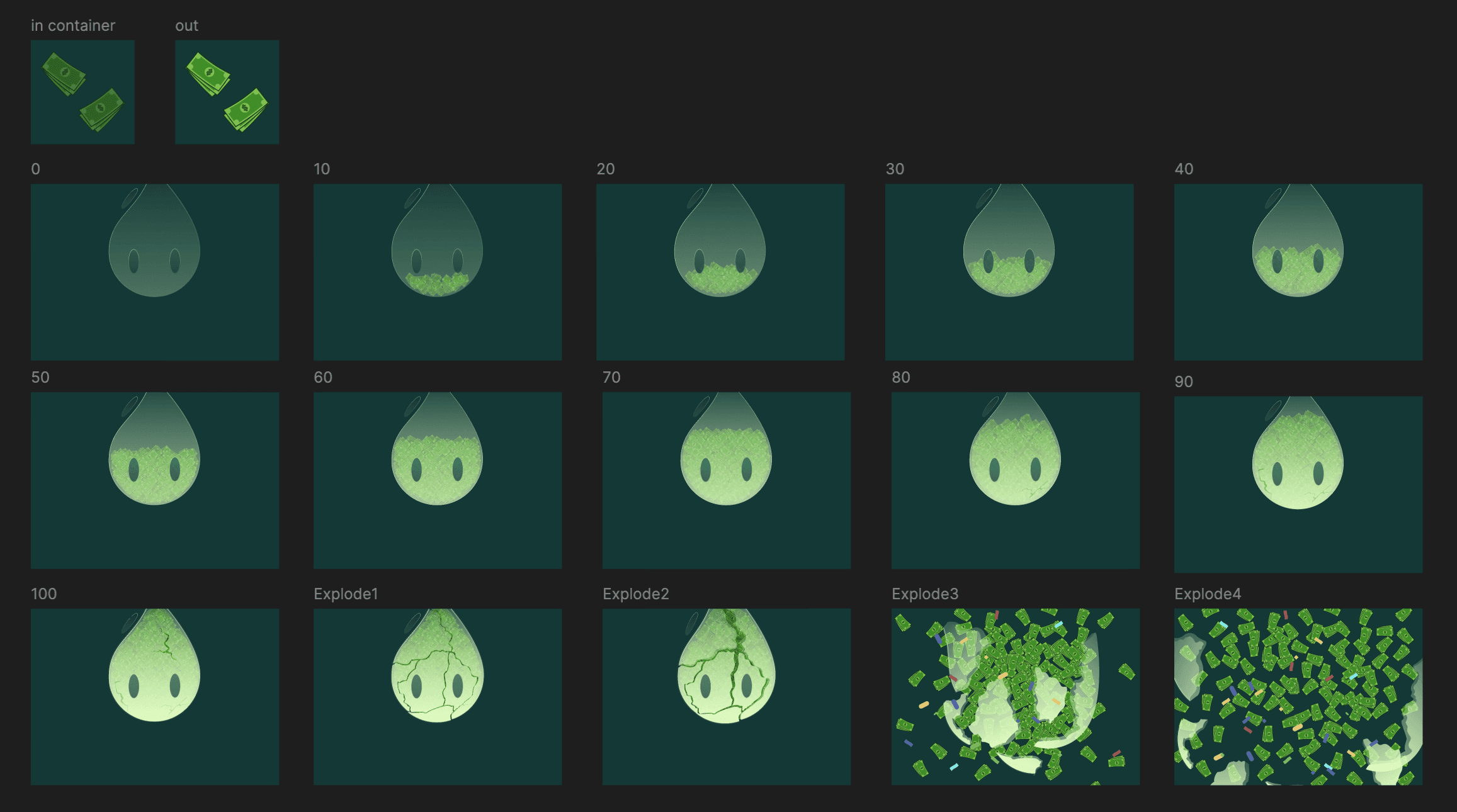
The Impact
By transforming abstract financial data into a tangible, visual goal, we increased community participation by over 40% in the first month alone. The finance page, typically the most utilitarian section of any platform, became one of our most visited and engaging features.
Beyond Functional Interface
Through these three design innovations, we fulfilled our CEO's vision of making every aspect of our platform an extension of the game experience. Users didn't just play our game—they lived within its world, even when performing the most routine platform interactions.