Goal
“I need simplicity, not extra features.”
Rather than adopting complex third-party governance solutions, my research revealed a critical insight when our CEO proclaimed: 'These tools are overwhelming—I need simplicity, not extra features!' This pivotal moment led us to develop our own streamlined governance tool with a crystal-clear mandate: eliminate complexity and embrace pure simplicity.
The Impact
From confusions on initial design to the final pure simplicity, I achieved the goal with three strategic steps: clear, simple, intuitive. These efforts achieved a 87% positive feedback rate in user testing.
1
+
2
+
3
=
Result
87% Positive feedback rate in user testing
The Money
What are the Essentials?
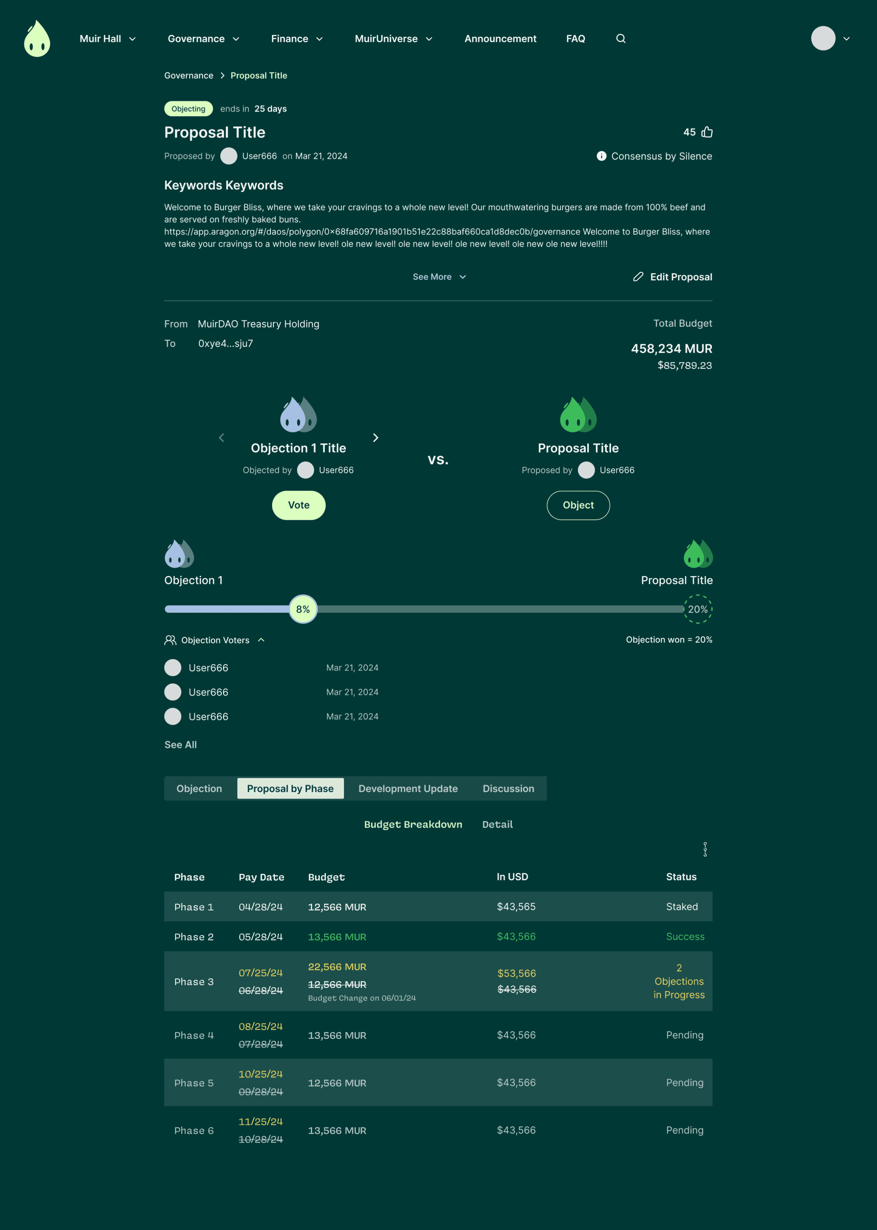
Simplicity means providing only the essential features that help users govern the community effectively. In our business model, users submit proposals to raise funds from the community to build within the game universe and earn rewards. The community operates on a consensus of silence principle—without objections during a specified period, proposed budgets are automatically transferred from the community treasury.
When analyzing this governance mechanism, I asked myself: 'What matters most to members?’ It’s the money or the proposed budget and how those funds will be utilized.
Proposal Summary
+
Budget
Journey Mapping
Gears Users Need to Create a Proposal
In order for users to view a proposal, they must first create one themselves. Beyond including relevant proposal information, it's crucial to educate users about the voting mechanism—consensus by silence.
When I presented the journey mapping to the team, our CEO responded: 'That's all we need. This is what I call simple.'
Summary
Budget
Voting
Confim
Is It Simple to Use?
My First Users
After completing the wireframes for creating a proposal, I shifted focus to the next priority—viewing a proposal. With the proposal creation process established, I arranged information on the page based on how users would naturally digest a proposal. Given the complexity of information involved, the challenge was designing the interface in an intuitive, clear, and clean manner.
Rather than walking the team through my design, I invited them to be my first test users. After a round of feedback filled with confusion about how they understood the page, I realized my design wasn't as simple to use as I had intended.
Finding Patterns in Confusions
Confused Labeling + Cognitive Overload
"After reviewing my notes on the team's feedback, I identified common points of confusion around specific components. Team members interpreted certain labels differently, and six out of eight members found the budget timeline difficult to comprehend. They struggled because too much information was condensed into a single area.
I had aimed for a clean design on visuals by minimizing the number of sections, but this approach compromised clarity. That was when I realized that to create an experience that feels simple to use, the first priority must be clear information delivery.
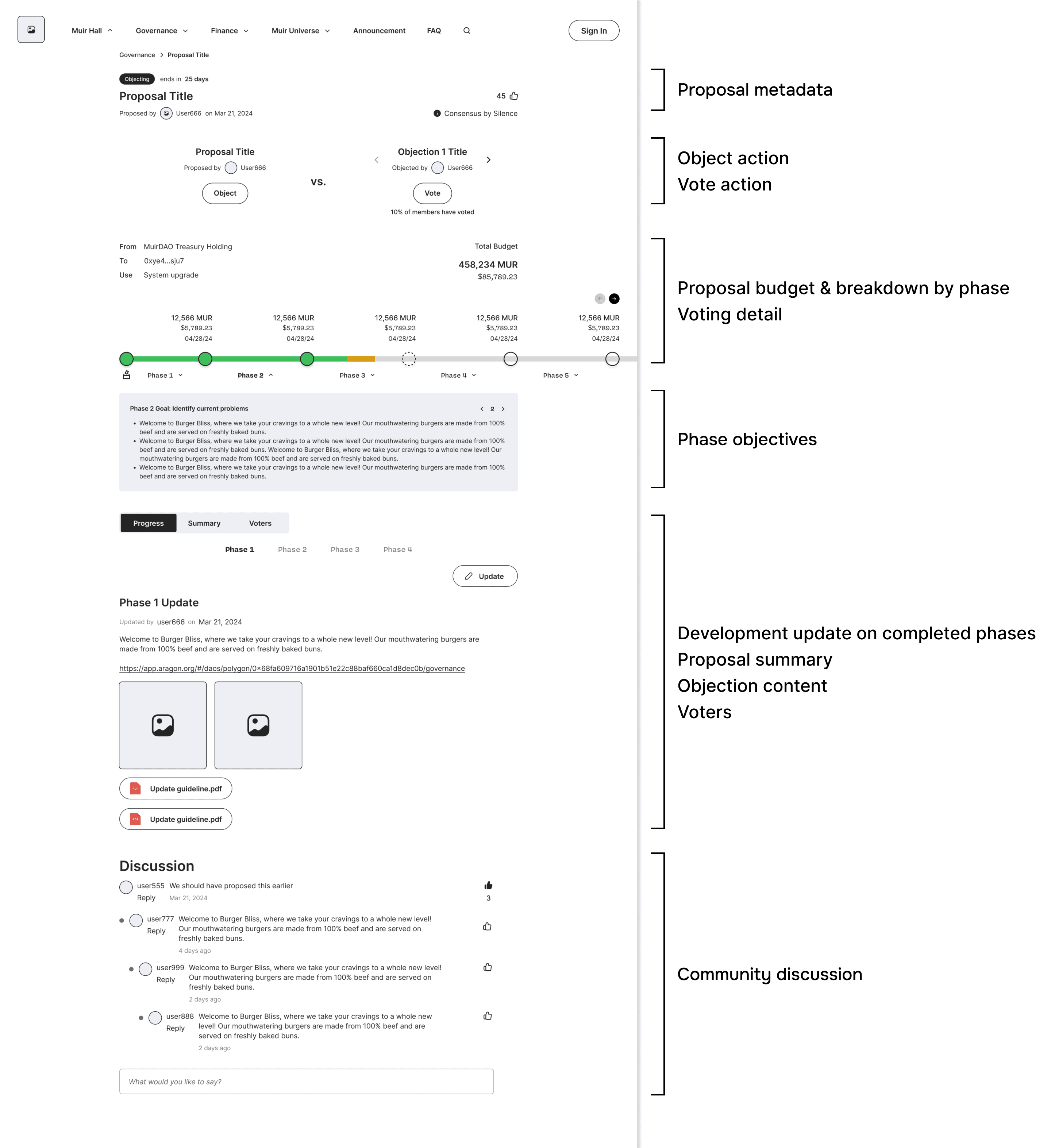
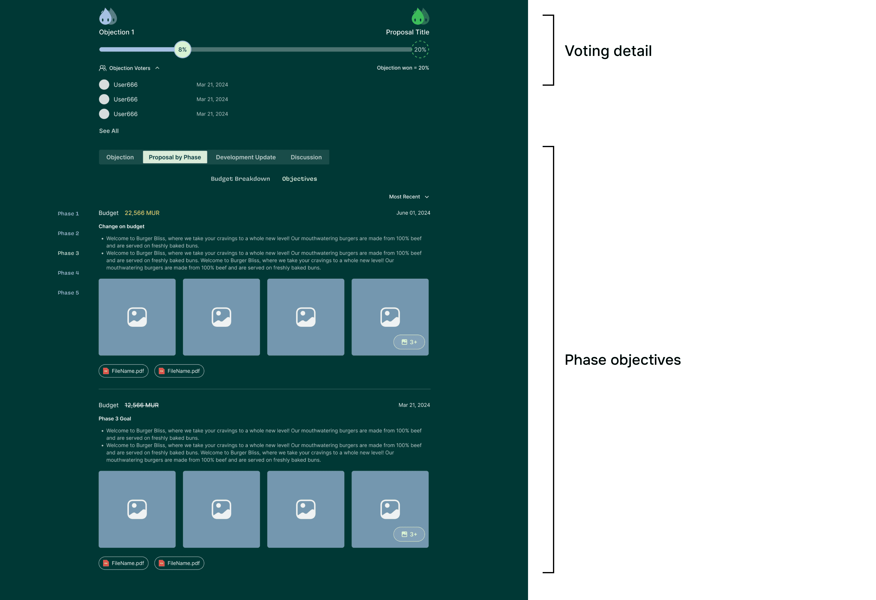
Step 1: Make it Clear
Clear Labeling
To ensure clearness, I iterated the tab labelings to distinguish corresponding content.
Development Update on Completed Phase
Before
After
Phase Objectives
Before
Phase 2 Goal: Identify current problems
2
Welcome to Burger Bliss, where we take your cravings to a whole new level! Our mouthwatering burgers are made from 100% beef and are served on freshly baked buns.
Welcome to Burger Bliss, where we take your cravings to a whole new level! Our mouthwatering burgers are made from 100% beef and are served on freshly baked buns. Welcome to Burger Bliss, where we take your cravings to a whole new level! Our mouthwatering burgers are made from 100% beef and are served on freshly baked buns.
Welcome to Burger Bliss, where we take your cravings to a whole new level! Our mouthwatering burgers are made from 100% beef and are served on freshly baked buns.
After
Subtab 1
Objectives
Step 2: Make it Intuitive
Regroup for Easier Digestion
To help users better digest the complex proposal, I highlighted a key mechanism—proposal by phase—by strategically regrouping the information.
Budget by Phase
+
Phase Objectives
=
Proposal by Phase
Before

After
Breakdown
Objectives
Step 3: Make it Simple
Breakdown the Chunk
Since the initial design caused cognitive overload with too much information packed into one section, I broke it down by giving each piece of essential information its own dedicated space.
Before
After

Make the Complex Simple
The Long-Awaited Simplicity
I tested my iterations with six users, and the results exceeded our expectations. The task completion rate improved by 25%. One participant even commented, 'Finally there is a simple tool to use in Web3!'
What began as the opposite of our goal ultimately achieved the simplicity we had envisioned. Although there were challenges along the way, the most effective solution proved to be identifying the right problem to solve and breaking it down into fundamental components.